In Transit
Simplifying the Shipping, Tracking, and Account Management experience at UPS.com

ROLE
Razorfish · Associate
Design Director
SCOPE
UX · UI · Product ·
Art Direction · Strategy
SPRINT
3 weeks
Atlanta, GA
OUTCOME
Functioning Prototype
& Secured Engagement
UPS came to Publicis/ Razorfish with a deceptively simple ask, make UPS.com easier to use. What followed was 3 weeks of intensive, in-person work with a small team, a whiteboard covered studio in Atlanta, and a single-minded focus on removing every unnecessary step between a user and their goal.
The result was a fully functioning prototype covering the three core flows of Shipping, Tracking, and Profile. redesigned from the ground up with clarity, hierarchy, and a deliberate warmth that the original site had long since lost.

THE BRIEF
UPS.com had grown cluttered over years of incremental additions. A navigation system that buried core tasks, a visual language that felt institutional rather than human, and transaction flows that put the burden squarely on the user.
The ask was focused, redesign the Shipping, Tracking, and Profile flows with an emphasis on reducing steps, simplifying navigation, and bringing the interface up to the standard users expected from best-in-class digital products.
The client made one key strategic call early that shaped everything: prioritize Shipping as the primary landing experience. Tracking users, while higher in volume, represented existing business. Shipping users represented growth. That single decision became the organizing principle of the entire redesign.
3
Week sprint, start to finish
3
Core flows redesigned end to end
6
Person team together in Atlanta, GA
PROCESS
The sprint followed a tight cycle: understand, explore, decide, build, repeat. Each morning we would huddle around the whiteboard for an open forum discussion. It started with flow mapping, stripping the existing site down to its structural bones to understand what was happening and where users were getting lost.
From there, the team translated those findings into a set of design principles: simplicity above all, utility first, warmth where it matters.


Typography exploration came early. The existing UPS visual language was functional but sterile. The team worked through type pairings and hierarchy systems that could carry both the transactional weight of a shipping form and the editorial openness of a content page, without feeling like two different sites stitched together.
Photography and illustration direction ran in parallel. Lifestyle imagery was treated not as decoration, but as a core design system element that communicated brand warmth.
Wireframes gave way to high-fidelity screens. The prototype grew screen by screen until the full flow was interactive and presentable.
NAVIGATION
The most consequential structural decision was the simplest: collapse the entire primary navigation into three items Shipping - Tracking - Profile always visible, always accessible, underlined in UPS gold to indicate active state. No buried menus for the things people came to do most.
The hamburger menu remained for secondary navigation, but the primary tasks lived at the top, permanently. The hierarchy was honest.


Primary Navigation — three primary destinations always visible in the header, with the active state underlined in UPS gold.


Secondary Navigation — The slide-out tray handles everything else featuring full site architecture without cluttering the primary navigation.
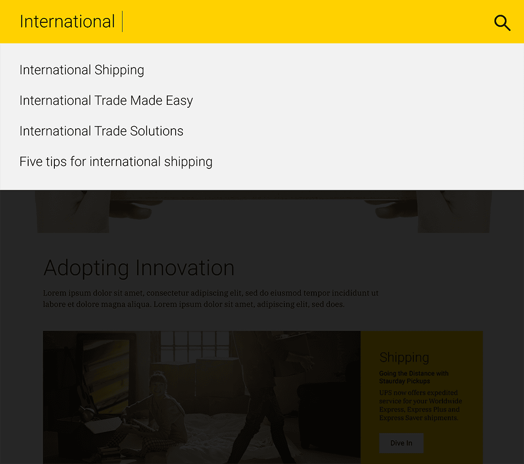
Global search bar — Intelligent autocomplete surfaces relevant pages and services instantly, reducing the need to navigate at all.
SHIPPING FLOW
The shipping flow was distilled to four focused screens.
Ship From → Ship To → Package Dimensions → Review.
Each step was one thing. Progress was communicated through a numbered step indicator. On mobile we employed a dot-based stepper at the bottom. On desktop, a vertical yellow rail anchored to the right edge, numbered 01–04.

Step 01 — Ship From. Single-column form optimized for mobile with a dot-based progress stepper at the bottom.

Step 02 — Ship To. Sender and recipient details collected in two focused steps before any package information is requested.

Step 03 — Package Dimensions. One decision at a time, always with a clear path forward.

Step 04 — Review. All shipment details consolidated in a single screen before commit, with each section editable in place.

On desktop, FROM and TO share a single screen completing two endpoints in one moment. The layout mirrors how users think about shipping as a single transaction with a clear direction.
What takes two steps on mobile resolves to one on desktop, cutting friction without cutting clarity.
TRACKING FLOW
The Tracking experience was redesigned around the assumption that users often track more than one shipment. The list view displayed multiple shipments simultaneously, each with an embedded map, origin in yellow, destination in teal, the truck icon marking current position.
At a glance, users had everything they needed without drilling into detail pages. The detail view added a vertical timeline, completed steps in UPS gold, pending in muted grey. Clean, scannable, calm.

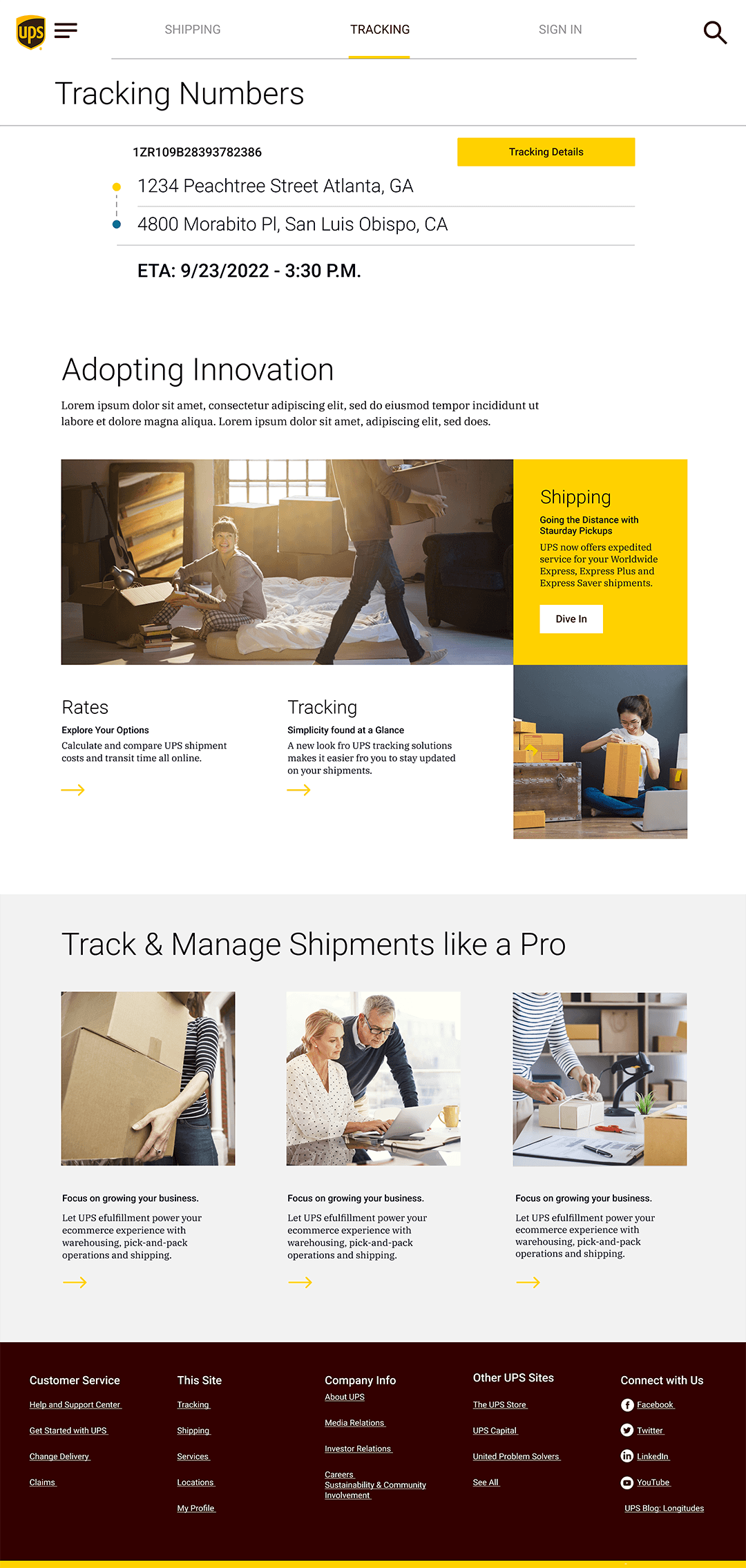

Tracking Details — full-width route map with a vertical event timeline below. Completed milestones marked in UPS gold, pending steps in muted grey.

Mobile — step 01, thumb-friendly form with dot progress stepper.
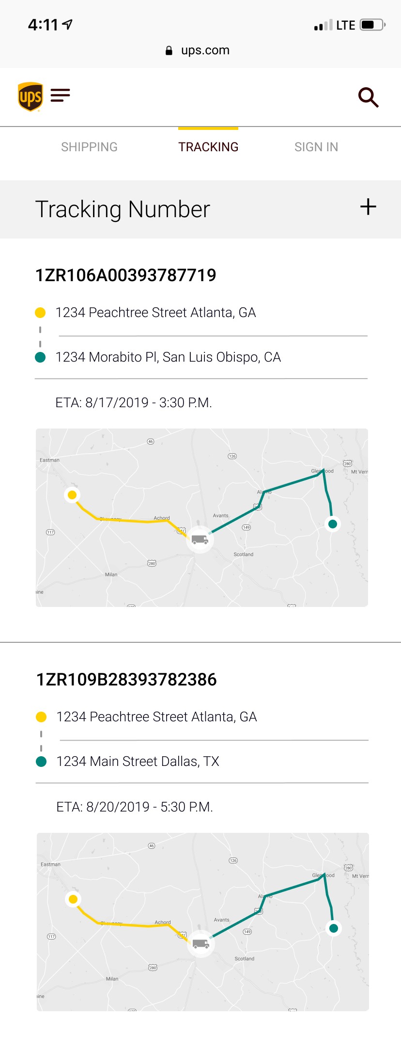
Mobile — scrollable multi-shipment list with a map preview per item. Everything visible at a glance, no drilling required.

FIX THIS SCREEN
PROFILE
The Profile page was reconceived as a personal dashboard rather than a form. Information, Addresses, Payment, a live Shipment map, and Shipping Preferences all surfaced in a single scrollable bento view organized by priority and use frequency. The embedded map gave the Profile a sense of life that a static settings page never could.


Profile — a living dashboard. Active shipment map, addresses, payment, and preferences all in one scrollable view. Payment called out in UPS gold.
ART DIRECTION
The article and services pages carried the design system into content territory. Full-bleed lifestyle photography, people packing at home, small business owners at desks, healthcare workers in the field. We took the opportunity to treat these pages as as our core visual tool to establish the design language and art direction.
The contrast was intentional. The stripped-down utility of the transactional flows alongside the warmth of editorial content to tell the complete brand story. UPS isn't just infrastructure. It's the thing that keeps people's lives and businesses moving.


The editorial design language extends beyond utility into genuine brand storytelling. Lifestyle photography, generous whitespace, and card-based content modules.
THE OUTCOME
The team presented the prototype to UPS leadership at the close of the sprint. The room's reaction was immediate. The strategic thinking around navigation landed exactly as intended, and the visual creative drew genuine enthusiasm.
The specific screens in this prototype were never meant to ship as is, a 3-week RFP sprint isn't a production build. But the prototype we built won the work for the agency, and Razorfish/ Publicis continued the relationship with UPS beyond the sprint.
The following year, UPS launched an updated site. The simplified primary navigation, clearer relationship between Shipping, Tracking, and Profile, and streamlined shipping flow all reflect the strategic thinking and design developed during the sprint.
Fully functioning prototype delivered within a 3 week sprint. Shipping, tracking, and profile flows end-to-end.
Unified shipping, tracking, and profile into a product vision that gave UPS a tangible blueprint for its future digital experience.
Navigation architecture and flow logic subsequently reflected in UPS's live site redesign.
Secured engagement for one of the world's leading digital agencies in a 3 week RFP sprint.